case
Somewhere.
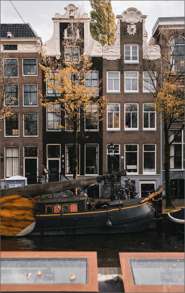
In Amsterdam
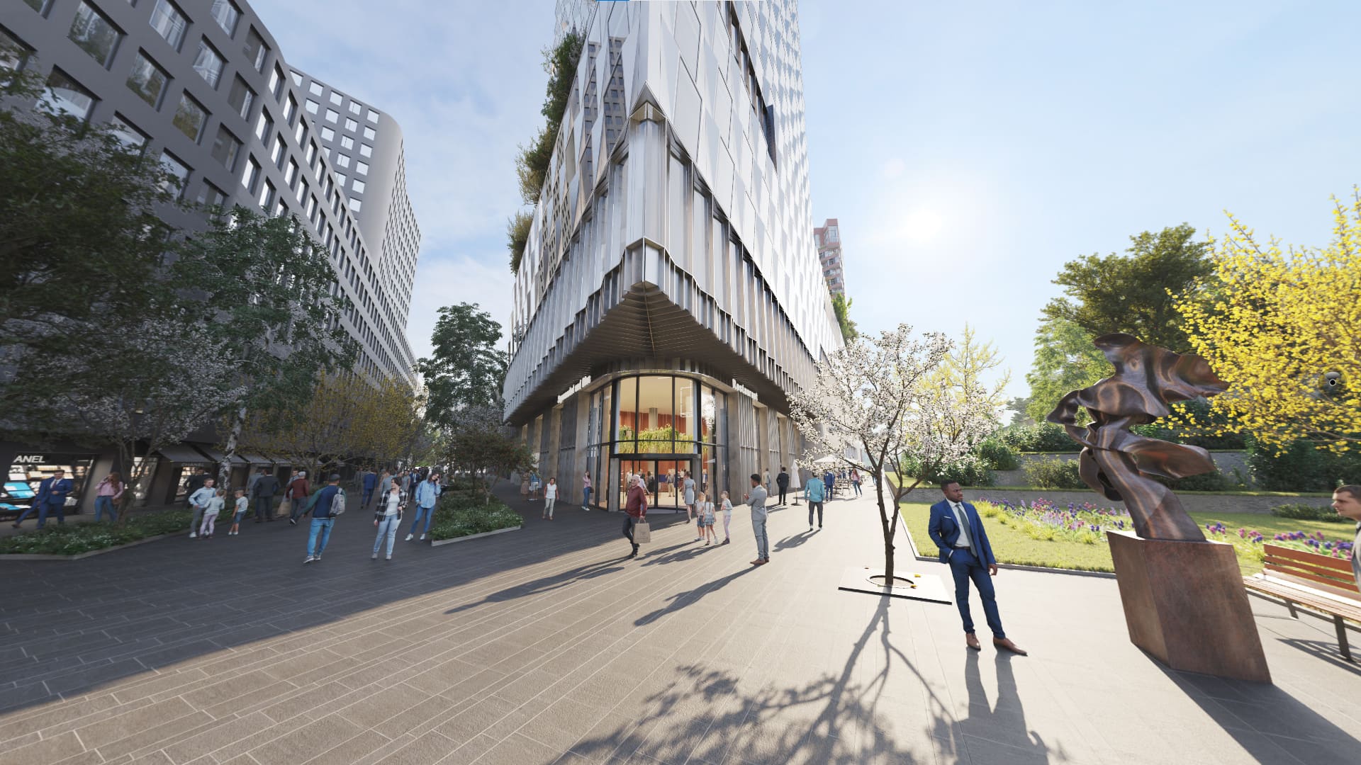
There is no other place for The Pulse to have been developed. Looking at its distinctive ‘Amsterdam School’ style of orange brickwork, white window frames, and prominent bays, you simply know this building could only have been erected in the very place. And that place is Amsterdam.
future building
Team task
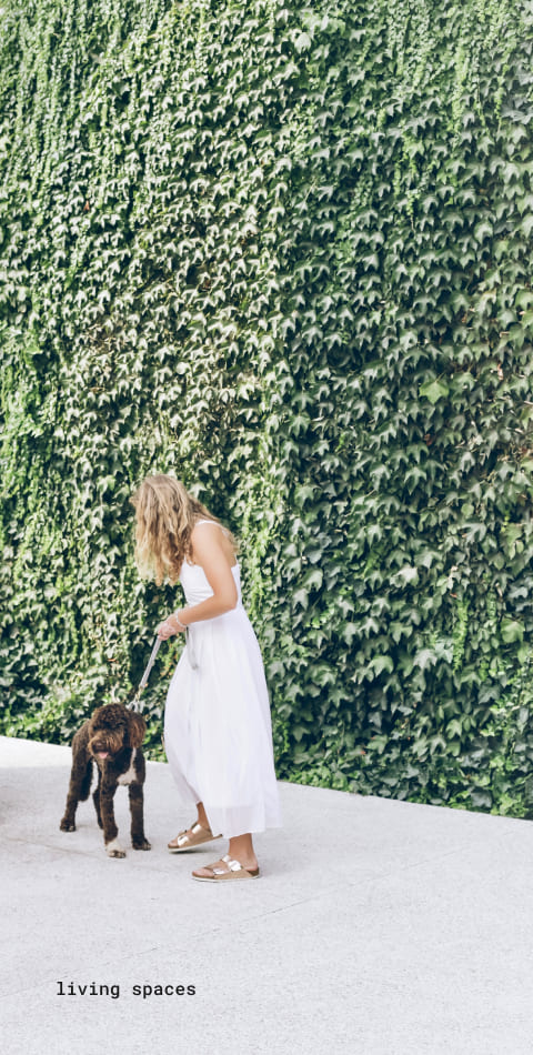
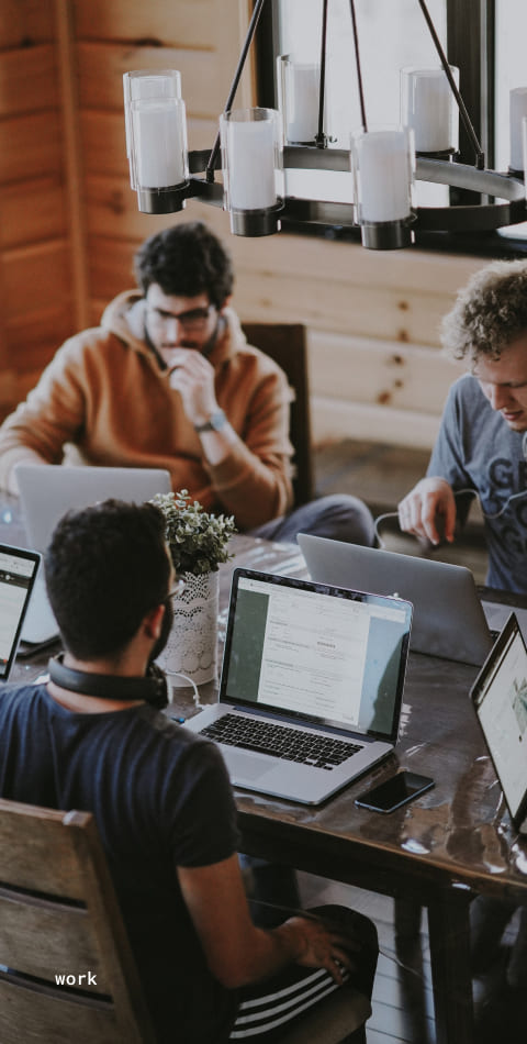
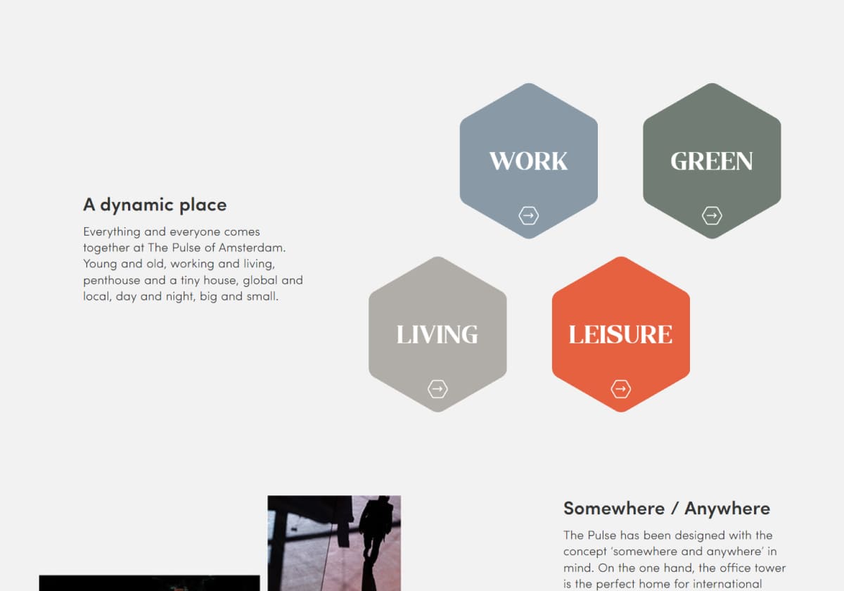
The client turned to us when they had already had several visualizations, a corporate identity, and a clear project positioning. VERO team was required to breathe virtual life into the project - to create an effective digital ecosystem with the necessary interactive tools for marketing the project at the sales stage. We wanted to give the potential clients a digital experience with all 4 parts of The Pulse: living spaces, leisure facilities, working spots, and a green environment.


Solutions
As a solution, we developed a user-friendly platform which offers a total immersion into the project space. We paid exceptional attention to highlighting the multifunctionality of The Pulse yet provided the user with simple and intuitive tools for searching and selecting a property.
That is why the VERO team focused on developing a website that features a smart combination of various interactive and visual products, such as
- 360 images
- animation
- AR app
- spinner
- website
visualization

details
balance between luxury and cosy
environment

people
place where you feel home and always
want to get back - homey details, telling story of real people
choose & tap a symbol to view interactive zoom
visualization
Animation
In this case, we created an animated scene with a panoramic view to show the smooth movement through the main towers of The Pulse. It gives a clear idea of what the whole ensemble looks like and flatters a huge green space integrated into it.This animation turned out to be really efficient when it came to further promo content and branded video.
digital commercial tools
digital commercial tools
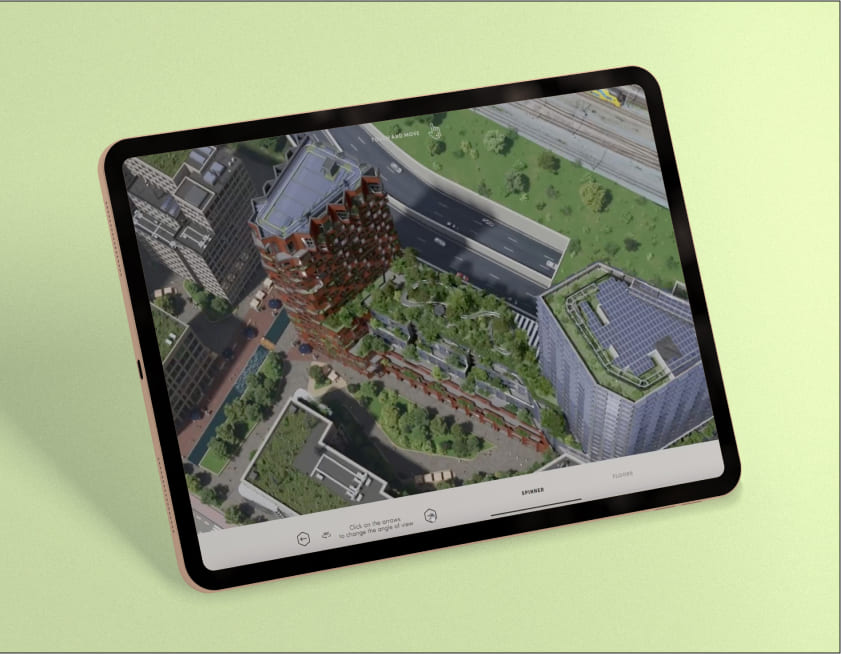
Spinner
This Spinner was created for the user to get a clear idea of the building structure and floorplans. We kept the design and navigation nice and simple. There’s not a single detail that makes the UX heavy. Using this Spinner you can appreciate a smooth and user-friendly experience. Just take a look at the screen below.
Clean design
with the focus on
the main benefits
Construction tracking
with an infographic
Attention to the concept
by telling a story
“Teaching” the clients
using examples
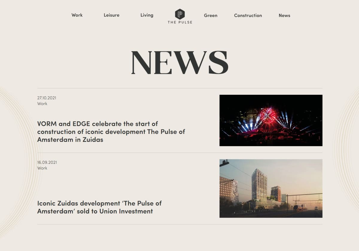
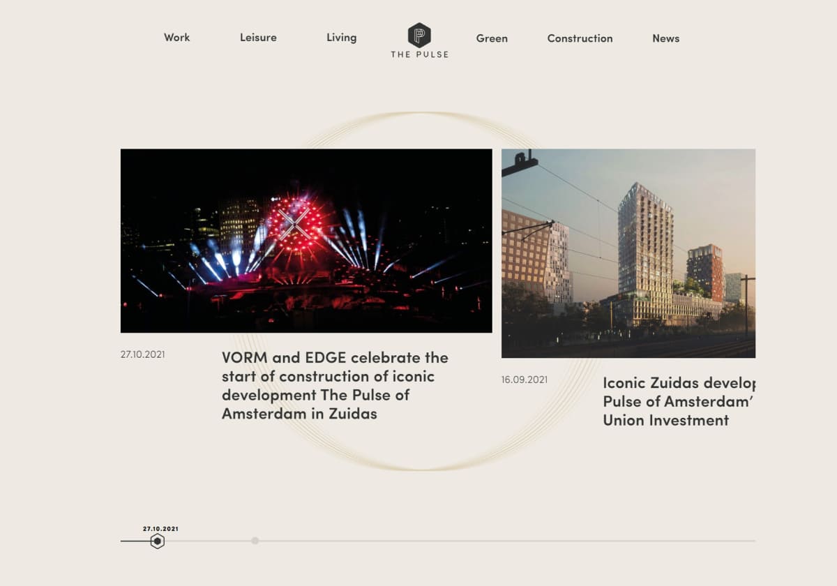
Continuously maintaining
contact with the audience
through a News page
Project Summary
- VERO team
Rustam Kerimov – Innovation Director
Vladimir Solovenyuk – Interactive developer
Hanna Kupruk – Designer
Ivan Galimov - CG Artist
Viktor Volochko - CG artist
- Client
Developer - EDGE, VORM